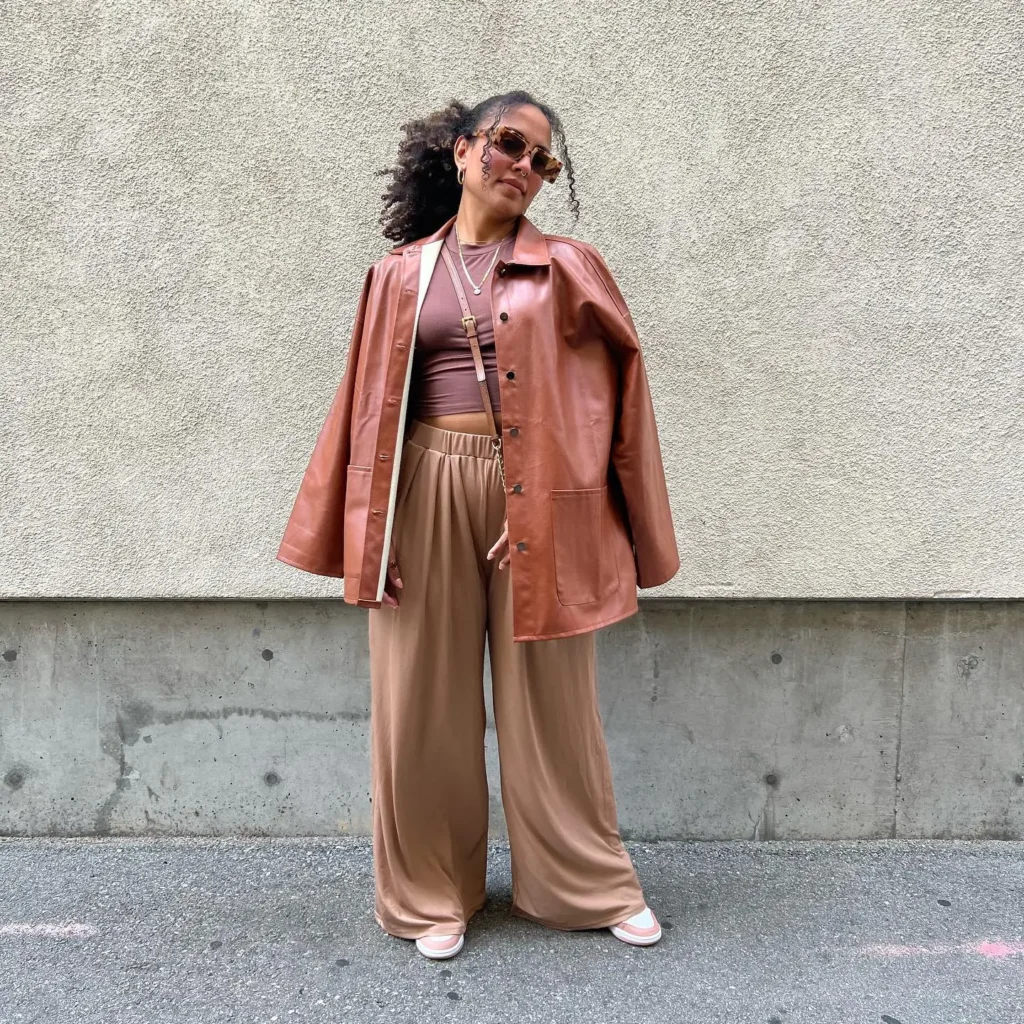
Color Theory in Fashion is a powerful tool that can transform your wardrobe and elevate your personal style. Color influences not only how we look but also how we feel and how others perceive us. From boosting confidence to expressing creativity, the right colors can make a world of difference.
Color plays a crucial role in fashion choices and personal style. It can highlight your best features, create harmonious looks, and convey emotions. Whether it’s the bold red dress that makes you feel unstoppable or the calming blue blouse that sets a serene tone, color is an essential element in fashion.
This guide covers the fundamentals of color theory, using the color wheel, seasonal color analysis, and practical applications. You’ll learn how to choose the right colors for any occasion, understand the emotional impact of colors, and effectively incorporate prints and patterns.
Understanding Color Theory

Color theory is the foundation of understanding how colors interact, blend, and complement each other. It’s a crucial concept in fashion as it helps in creating visually appealing and harmonious outfits. Color theory explains the science and art of using color, considering how hues influence perception and evoke emotions.
In the world of fashion, color is more than just a visual treat; it’s a powerful tool that can alter perceptions and style. For instance, certain colors can make an outfit look more sophisticated, vibrant, or understated. By understanding color theory, fashion designers and stylists can make informed choices that enhance the wearer’s appearance and express the desired mood or message.
Colors have a profound impact on how we perceive and feel about an outfit. For example, wearing bright colors can make you appear more energetic and youthful, while neutral tones can convey a sense of calm and sophistication. This is why mastering color theory is essential for anyone looking to refine their fashion sense or design collections that resonate with audiences.
The Color Wheel: Primary, Secondary, and Tertiary Colors
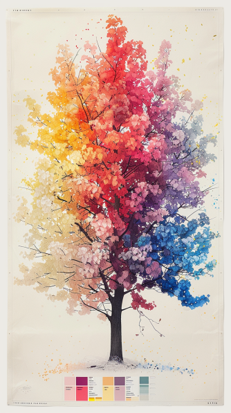
The color wheel is a visual representation of colors arranged according to their chromatic relationship. It is divided into primary, secondary, and tertiary colors, which together form the basis of color theory.
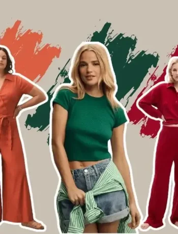
Primary Colors: These are the foundational colors that cannot be created by mixing other colors. In fashion, the primary colors are red, blue, and yellow. These colors are vibrant and often used to make bold fashion statements.
Secondary Colors: These colors are formed by mixing two primary colors. The secondary colors are green (blue + yellow), orange (red + yellow), and purple (red + blue). They provide more variety and options for creating stylish outfits.
Tertiary Colors: These are created by mixing a primary color with a secondary color, resulting in hues like red-orange, yellow-green, and blue-purple. Tertiary colors add depth and complexity to fashion designs, allowing for more nuanced and sophisticated color palettes.
The color wheel’s structure helps in understanding the relationships between colors, which is crucial for creating cohesive and visually appealing outfits. By using the color wheel, you can easily identify which colors complement each other and which combinations might clash.
Understanding the basics of the color wheel and the relationships between primary, secondary, and tertiary colors enables fashion enthusiasts to experiment with various color combinations confidently. This knowledge is not only beneficial for everyday styling but also essential for fashion designers who aim to create balanced and harmonious collections.
Color Schemes in Fashion
Color schemes are fundamental in fashion, guiding how different colors can be combined to create stylish, balanced, and visually appealing outfits. Let’s explore the primary color schemes used in fashion design: complementary, analogous, and monochromatic colors.
Complementary Colors
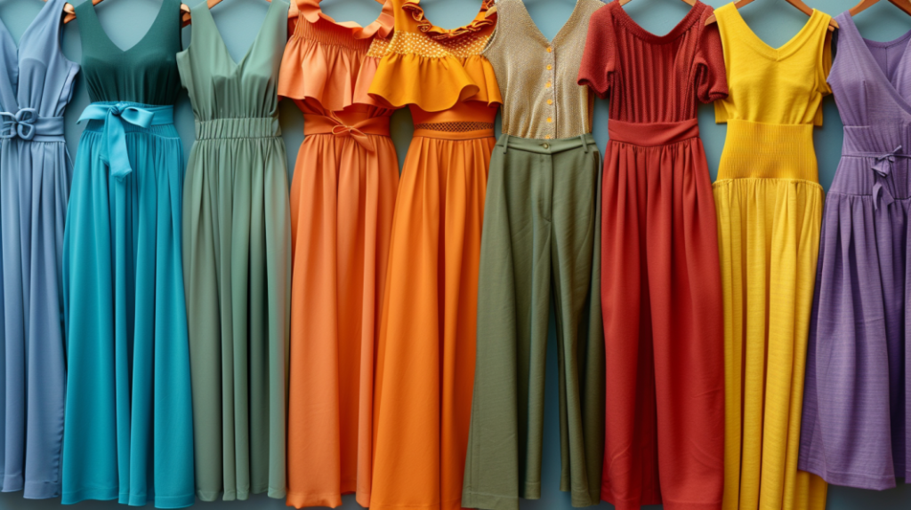
Complementary colors are pairs of colors that sit opposite each other on the color wheel. These colors create a vibrant contrast when used together, making each color appear more vivid.
Examples:
- Red and green
- Blue and orange
- Yellow and purple
How to Use Complementary Colors in Fashion
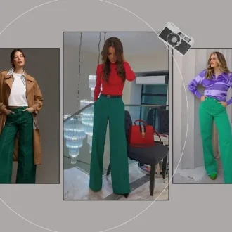
Using complementary colors can make a bold fashion statement. For instance, pairing a blue dress with orange accessories can create a striking, eye-catching outfit. This approach works well when you want to stand out and make a memorable impression.
Practical Tip: To balance the boldness of complementary colors, incorporate neutral shades like black, white, or beige to tone down the intensity.
For more insights on how to incorporate complementary colors into your wardrobe, check out our detailed guide on Using Complementary Colors in Fashion.
Analogous Colors
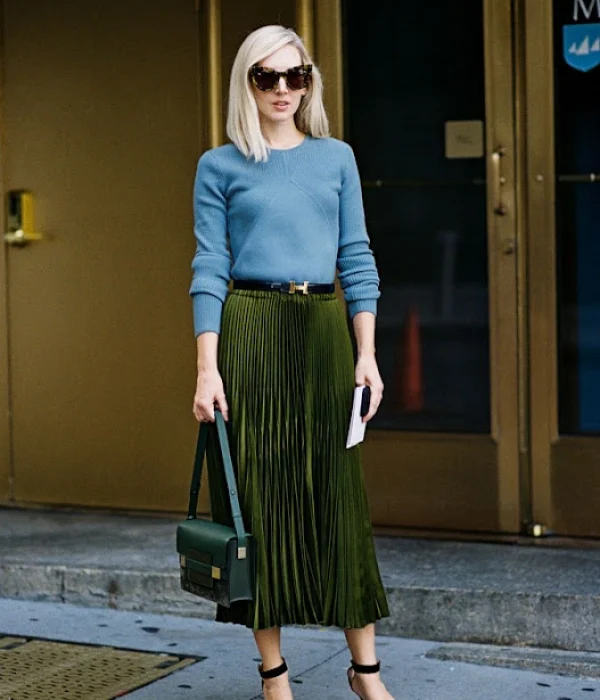
Analogous colors are groups of three colors that sit next to each other on the color wheel. These colors typically match well and create serene and comfortable designs.
Examples:
- Blue, blue-green, and green
- Red, red-orange, and orange
- Yellow, yellow-green, and green
How to Create Harmonious Outfits Using Analogous Colors
Analogous color schemes are perfect for creating harmonious and cohesive outfits. For example, an outfit consisting of a blue blouse, blue-green skirt, and green accessories will look naturally stylish and put-together.
Practical Tip: To avoid the outfit looking too monochromatic, vary the textures and patterns of the fabrics used.
Monochromatic Colors
A monochromatic color scheme uses different shades, tints, and tones of a single color. This approach creates a clean and sophisticated look.
How to Create Stylish Looks with Monochromatic Color Schemes
Wearing different shades of one color can be incredibly chic and visually elongating. For example, combining light gray pants, a charcoal blazer, and a silver top creates a refined and elegant ensemble.
Practical Tip: Mix different textures (like silk, wool, and leather) to add depth and interest to a monochromatic outfit.
How to Use Each Color Scheme
Practical Tips for Incorporating Each Color Scheme into Outfits:
Complementary Colors:
- Use for bold, attention-grabbing outfits.
- Balance with neutral colors to avoid overwhelming the eye.
- Ideal for statement pieces and accessories.
Analogous Colors:
- Perfect for creating cohesive and harmonious looks.
- Great for layering and combining different pieces.
- Vary textures and patterns to add interest.
Monochromatic Colors:
- Use for a sleek and sophisticated appearance.
- Mix various shades and tones of the same color.
- Incorporate different fabrics to keep the outfit from looking flat.
For more advanced tips on using color theory in fashion, explore our comprehensive Color Theory Tips for Fashion Designers.
Seasonal Color Analysis
Seasonal color analysis is a fascinating approach to understanding which colors best complement an individual’s natural features, such as skin tone, hair color, and eye color. This method helps fashion enthusiasts and designers alike to create harmonious and flattering wardrobes.
The Four Primary Seasons
Seasonal color analysis categorizes people into four primary seasons: Winter, Spring, Summer, and Autumn. Each season has its own set of colors that enhance natural beauty, ensuring that your outfits always look cohesive and complementary.
Defining the Four Primary Seasonal Palettes:
- Winter: People with Winter coloring typically have cool undertones with high contrast between their skin, hair, and eyes. The Winter palette includes bold, cool colors like icy blues, stark blacks, and bright jewel tones.
- Spring: Those with Spring coloring usually have warm undertones with clear, bright features. The Spring palette features warm, light colors such as peach, coral, and sunny yellow.
- Summer: Individuals with Summer coloring have cool undertones with softer, muted features. The Summer palette includes cool, pastel shades like lavender, soft pink, and powder blue.
- Autumn: People with Autumn coloring have warm undertones with rich, earthy features. The Autumn palette embraces warm, deep colors like olive green, burnt orange, and chocolate brown.
To dive deeper into understanding the differences between warm and cool colors and how they apply to seasonal palettes, check out our comprehensive guide on Understanding Warm and Cool Colors.
The 12-Season Color Analysis
The 12-season color analysis builds upon the traditional four seasons, offering a more personalized approach. Each primary season is divided into three sub-seasons, providing a nuanced palette that takes into account variations in individual coloring.
Personalized Color Palettes of the 12 Seasons
- Winter: True Winter, Bright Winter, Deep Winter
- Spring: True Spring, Bright Spring, Light Spring
- Summer: True Summer, Light Summer, Soft Summer
- Autumn: True Autumn, Deep Autumn, Soft Autumn
How to Determine Your Seasonal Color Palette
- Determine Your Skin Undertone: Check the color of your veins. If they appear blue, you likely have cool undertones. If they appear green, you likely have warm undertones.
- Examine Your Natural Hair and Eye Color: Identify whether your natural hair and eye colors are deep, light, bright, or soft.
- Use a Color Draping Test: Hold different colored fabrics near your face in natural light to see which colors make your skin glow and which make it look dull.
- Identify Your Contrast Level: Determine if there’s a high contrast (e.g., dark hair, light skin) or low contrast (e.g., light hair, light skin) between your features.
Tips for Choosing Colors That Complement Your Natural Coloring
- For Cool Undertones: Opt for colors with blue or pink bases.
- For Warm Undertones: Choose colors with yellow or golden bases.
- For High Contrast: Bright, bold colors will look striking.
- For Low Contrast: Soft, muted colors will harmonize best.
For more detailed guidance on how to use color theory to enhance your wardrobe, explore our article on How to Use Color Theory for Clothing.
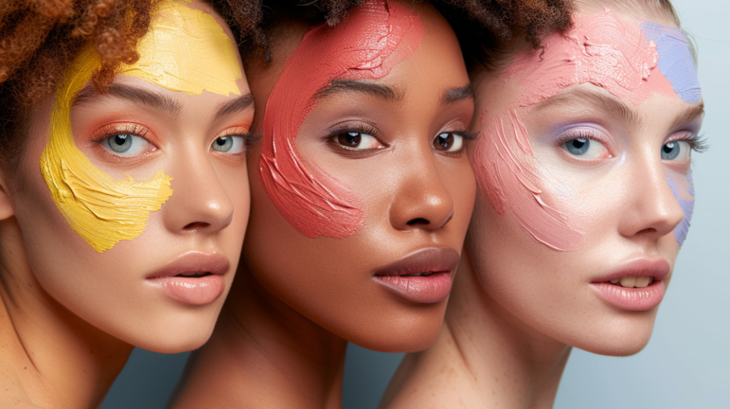
Understanding your skin undertone is a crucial step in mastering color theory for fashion. Your undertone affects how colors look on you, influencing everything from clothing to makeup choices. Let’s explore the different types of undertones and how to identify yours.
Warm Undertones
Warm undertones have a golden, yellow, or peachy hue. People with warm undertones tend to look best in colors like earthy shades, warm reds, and yellows. Gold jewelry often complements warm undertones beautifully. If you tan easily and your veins appear greenish, you likely have warm undertones.
Cool Undertones
Cool undertones have a blue, pink, or red hue. Those with cool undertones typically look stunning in jewel tones, cool blues, and vibrant pinks. Silver jewelry usually enhances cool undertones. If you burn before you tan and your veins appear blue or purple, you probably have cool undertones.
Neutral Undertones
Neutral undertones are a mix of both warm and cool. People with neutral undertones can wear a wide range of colors, including both warm and cool shades. They also look great in both gold and silver jewelry. If you can wear both warm and cool colors without looking washed out and your veins are not distinctly blue or green, you likely have neutral undertones.
Methods to Find Your Skin Undertone
1. Vein Test
Examine the veins on the inside of your wrist under natural light. If your veins appear blue or purple, you have cool undertones. If they look greenish, you have warm undertones. If you can’t quite decide whether they are blue or green, you might have neutral undertones.
2. Jewelry Test
Think about whether you look better in gold or silver jewelry. If gold enhances your complexion, you have warm undertones. If silver looks more flattering, you have cool undertones. If both look good on you, you might have neutral undertones.
3. White Paper Test
Hold a piece of white paper up to your face in natural light. If your skin looks more yellow next to the paper, you have warm undertones. If it looks pink or rosy, you have cool undertones. If you see a mix of both, you are likely neutral.
4. Sun Test
Consider how your skin reacts to the sun. If you tan easily and rarely burn, you probably have warm undertones. If you burn easily and rarely tan, you likely have cool undertones. If you both tan and burn, you may have neutral undertones.
Impact on Color Choices
Knowing your skin undertone helps you choose colors that complement your natural complexion, enhancing your overall look. For warm undertones, opt for colors like coral, olive, and warm reds. For cool undertones, choose shades like sapphire, emerald, and icy pink. Neutral undertones can enjoy the versatility of both color families, making wardrobe choices even more flexible.
Practical Applications of Color Theory
Color theory isn’t just an abstract concept; it has real, tangible applications in fashion. Understanding how to choose the right colors for different occasions, how colors affect your figure, and the role of fabric prints and patterns can elevate your style game to new heights.
Choosing Colors for Different Occasions
- Professional Settings: Opt for neutral and subdued colors like navy, black, gray, and white. These colors convey professionalism and competence. A navy blazer or a black pencil skirt can make a powerful impression in a business meeting.
- Casual Outings: For casual settings, feel free to experiment with brighter and more relaxed colors. Think pastels for a day at the park or vibrant hues for a casual lunch with friends.
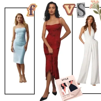
- Evening Events: Rich, deep colors like emerald green, burgundy, and midnight blue work well for evening events. They exude elegance and sophistication, making them perfect for dinners or formal parties.
- Special Occasions: Depending on the event, you might want to wear colors that stand out. Bright reds, metallics, and jewel tones are great for celebrations and festivities.
For more tips on incorporating color into your wardrobe, explore our guide on How to Use Color Theory for Clothing.
How Colors Affect Your Figure
- Dark Colors: Dark shades like black, navy, and charcoal can create a slimming effect, making them ideal for areas you might want to downplay.
- Light Colors: Light colors such as white, beige, and pastel shades can make areas appear larger. Use these to highlight parts of your body you want to emphasize.
- Bold Colors: Bright and bold colors draw attention. Use them strategically to accentuate your best features, like a bright belt to highlight your waist.
Tips for Using Color to Enhance or Downplay Features
- To create a balanced look, combine light and dark colors. For example, if you want to minimize your hips, wear darker pants and a lighter top.
- Vertical stripes and dark monochromatic outfits can elongate your silhouette, making you look taller and leaner.
- Horizontal stripes and bright prints can add volume, useful for balancing out proportions if you have a smaller upper body.
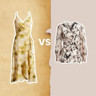
The Role of Fabric Prints and Patterns
Prints and patterns can significantly impact the perception of an outfit, and their colors play a crucial role in this.
Examples of Effective Use of Prints and Patterns:
- Floral Prints: Soft, pastel floral prints can create a romantic and feminine look. Dark, bold floral patterns can add drama and sophistication.
- Stripes: Vertical stripes can make you look taller, while horizontal stripes can add width. Pairing stripes with solid colors can balance the effect.
- Animal Prints: Leopard or snake prints in neutral tones can act as a statement piece without overwhelming the outfit. Pair with solid colors to let the print stand out.
- Geometric Patterns: These can add a modern and edgy vibe to your outfit. Use geometric patterns in complementary colors for a harmonious look.
Prints and patterns should be used thoughtfully to enhance your overall style. The right combination of color, print, and pattern can make a powerful fashion statement.
For more in-depth tips on color theory and fashion design, check out our article on Color Theory Tips for Fashion Designers.
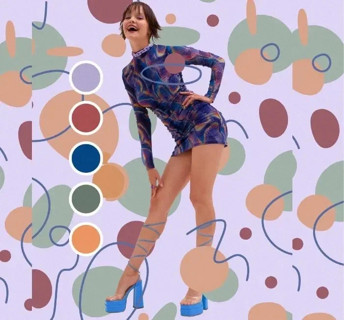
Emotional Impact of Colors
Color isn’t just about aesthetics; it’s a powerful tool that can evoke emotions and influence perceptions. Understanding the emotional impact of colors can help you create outfits that not only look good but also make you feel a certain way.
Common Color-Emotion Associations
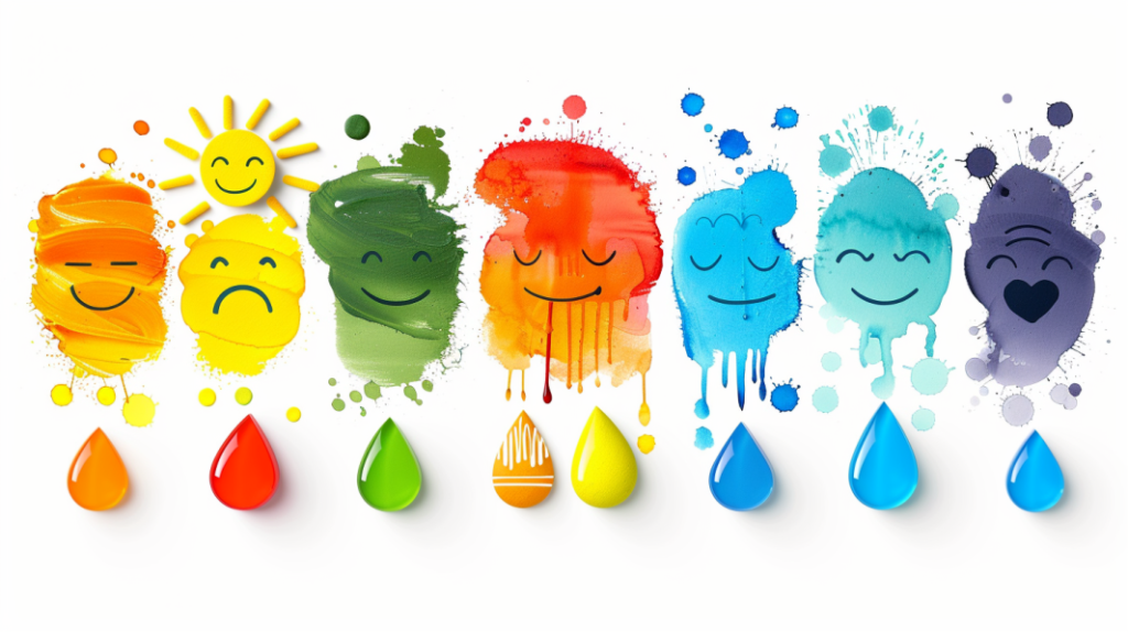
Different colors are associated with various emotions, and knowing these associations can help you choose the right colors to convey the desired mood.
- Red: Passion, energy, and excitement. Wearing red can make you feel bold and confident. It’s perfect for making a statement or boosting your energy.
- Blue: Calm, trust, and tranquility. Blue is a soothing color that can help you feel more relaxed and centered. It’s ideal for business settings where trust and professionalism are key.
- Yellow: Happiness, optimism, and warmth. Yellow is a cheerful color that can lift your spirits and promote a positive outlook. It’s great for casual outings and social events.
- Green: Balance, growth, and rejuvenation. Green has a calming effect and is associated with nature and renewal. It’s a good choice for when you need to feel grounded and refreshed.
- Purple: Creativity, luxury, and mystery. Purple combines the stability of blue and the energy of red, making it a unique and intriguing color. It’s perfect for artistic and creative settings.
- Black: Power, elegance, and sophistication. Black is versatile and timeless, often used to convey authority and professionalism. It’s a go-to for formal occasions.
- White: Purity, simplicity, and cleanliness. White can make you feel fresh and crisp, ideal for minimalist styles and summer outfits.
How to Use Color to Influence Mood and Perception
Using color strategically can help you create the desired emotional impact with your outfits.
- Boost Confidence with Bold Colors: If you need a confidence boost, opt for bold colors like red or orange. These colors can make you feel more assertive and energetic.
- Create Calm with Cool Tones: For a calming effect, choose cool tones like blue or green. These colors are perfect for stressful environments or when you need to feel more relaxed.
- Evoke Happiness with Bright Hues: Wearing bright colors like yellow and pink can elevate your mood and make you feel more cheerful and optimistic.
- Enhance Creativity with Purple: If you’re in a creative field or need some inspiration, wear purple. It’s a color that stimulates imagination and innovation.
- Exude Sophistication with Neutrals: Neutral colors like black, white, and gray convey elegance and professionalism. They’re perfect for business settings and formal events.
For more insights on how to incorporate color into your wardrobe, explore our guide on How to Use Color Theory for Clothing.
Conclusion
Mastering color theory in fashion can dramatically enhance your style, helping you to create outfits that are visually appealing, emotionally impactful, and perfectly suited to any occasion.
By understanding and applying the principles of the color wheel, seasonal color analysis, and the practical use of colors, prints, and patterns, you can transform your wardrobe and express your personal style with confidence.
Embrace the power of color to elevate your fashion game and enjoy the creative journey of finding the perfect palette for you.