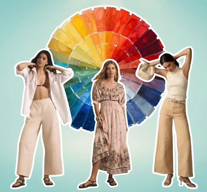
Unlock the secrets of color theory for clothing and transform your wardrobe like never before!
Understanding how to use colors effectively can make a world of difference in your personal style.
Whether you’re dressing for a high-stakes business meeting, a casual brunch, or an elegant evening out, mastering color combinations is your ticket to effortless chic.
Dive into our comprehensive guide on color theory for clothing and discover the transformative power it holds in fashion. Your style matters and now is the time to elevate it to new heights with the perfect color palette.
To dive deeper into the application of color theory in fashion design, check out our detailed guide on Color Theory Tips for Fashion Designers.
Understanding the Basics of Color Theory

Color theory is the backbone of fashion, guiding us in choosing harmonious colors that enhance our style and personality. Let’s break down the essentials of color theory and how it can help build a versatile wardrobe.
Primary Colors
Primary colors are the foundation of all other colors. They consist of red, blue, and yellow. These colors cannot be created by mixing other colors and are crucial for forming the base of the color wheel.
For a comprehensive understanding of how the color wheel can be used to create stunning outfits, explore our Color Wheel Guide for Fashion.
Secondary Colors
Secondary colors are created by mixing two primary colors. The secondary colors are:
- Green (blue + yellow)
- Orange (red + yellow)
- Purple (red + blue)
Tertiary Colors
Tertiary colors are formed by mixing a primary color with a neighboring secondary color. These include:
- Red-Orange
- Yellow-Orange
- Yellow-Green
- Blue-Green
- Blue-Purple
- Red-Purple
Understanding these relationships helps in creating balanced and appealing color schemes.
Color Wheel Overview
The color wheel is a circular diagram that organizes colors according to their relationships. It visually represents primary, secondary, and tertiary colors, showing how they mix and complement each other. Here’s why the color wheel is important in fashion:
- Complementary Colors: Colors opposite each other on the wheel, like blue and orange, create high contrast and vibrant looks.
- Analogous Colors: Colors next to each other, such as blue, blue-green, and green, offer harmonious and serene combinations.
- Triadic Colors: Three evenly spaced colors, like red, yellow, and blue, provide a balanced and vibrant palette.
Using the color wheel, you can easily identify which colors work well together, helping you create cohesive and stylish outfits.
Building a Versatile Wardrobe with Color Theory
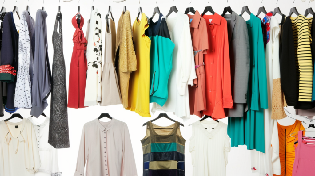
A versatile wardrobe is built on a foundation of neutral colors and complemented with carefully chosen accent colors.
Choosing Foundational Neutrals
Neutral colors like black, white, gray, and beige are the cornerstone of a versatile wardrobe. They are timeless, versatile, and can be mixed and matched with almost any other color. Here’s why each neutral is essential:
- Black: Sleek, slimming, and sophisticated. Perfect for formal events and professional settings.
- White: Clean, fresh, and versatile. Great for summer outfits and casual looks.
- Gray: Balanced and understated. Works well in professional attire and can be dressed up or down.
- Beige: Warm and neutral. Ideal for creating soft, elegant looks.
These neutrals form the backbone of your wardrobe, providing a base upon which you can build with accent colors.
Selecting Accent Colors
Accent colors add personality and vibrancy to your wardrobe. Here’s how to choose them:
Consider Your Skin Tone:
- Warm Undertones: Opt for warm accent colors like coral, mustard, and olive. These colors enhance your natural warmth.
- Cool Undertones: Choose cool accent colors like teal, sapphire, and magenta. These shades complement your cool undertones.
Personal Style:
- Bold and expressive? Try vibrant colors like red or electric blue.
- Prefer understated elegance? Soft pastels like lavender and blush pink can be perfect.
Seasonal Changes:
- Spring/Summer: Lighter, brighter colors like mint green and lemon yellow.
- Fall/Winter: Deeper, richer tones like burgundy and forest green.
By combining neutral basics with thoughtfully selected accent colors, you can create a dynamic wardrobe that is both versatile and stylish.
Popular Color Schemes in Fashion
Understanding different color schemes can revolutionize your approach to fashion. Here’s a detailed guide on how to use various color schemes. From complementary, analogous, monochromatic, and triadic to create stunning outfits.
Complementary Colors
Complementary colors are pairs of colors that sit opposite each other on the color wheel. These colors create a high contrast and vibrant look when used together.
- Red and Green: Think of a striking red dress with emerald green accessories.
- Blue and Orange: Picture a cobalt blue blouse paired with a burnt orange skirt.
- Yellow and Purple: Imagine a bright yellow top with a deep purple handbag.
Tips on Using Complementary Colors
- Balance Boldness: Complementary colors can be very bold, so use them strategically. If you wear a vibrant blue dress, tone it down with orange accessories rather than another large orange item.
- Neutral Anchors: Use neutral colors like black, white, or beige to anchor the look and prevent it from being overwhelming.
- Small Pops: If you’re not ready for a full complementary outfit, start with small pops of the complementary color, such as shoes, bags, or jewelry.
Analogous Colors
Analogous colors are groups of three colors that are next to each other on the color wheel. They typically match well and create serene and comfortable designs.
- Blue, Blue-Green, Green: A turquoise top with a navy blazer and mint green pants.
- Red, Red-Orange, Orange: A coral dress with a tangerine belt and rust-colored shoes.
- Yellow, Yellow-Green, Green: A lime green skirt paired with a chartreuse blouse and a forest green jacket.
How to Use Analogous Colors
- Create Harmony: Analogous colors are naturally harmonious. Use them to create a cohesive look that feels balanced and well put-together.
- Vary Textures: Add interest by varying the textures and fabrics of your clothing items. For example, a silk blouse with a wool skirt and a cotton jacket.
- Subtle Transitions: These colors blend seamlessly, so your transitions from one piece to another will be smooth and subtle, perfect for a polished appearance.
Monochromatic Colors
A monochromatic color scheme involves using different shades, tints, and tones of a single color.
- All Blue: Light blue jeans with a navy sweater and royal blue shoes.
- All Pink: A blush pink blouse with a fuchsia skirt and rose-colored heels.
- All Gray: A charcoal gray dress with a slate gray jacket and silver accessories.
Tips for Creating Monochromatic Outfits
- Play with Shades: Use a variety of shades to add depth and interest. For instance, pairing a pale pink top with a deep magenta skirt.
- Mix Textures: Combining different textures (like silk, wool, and denim) can make a monochromatic outfit more dynamic and less flat.
- Layering: Monochromatic looks are ideal for layering, as they keep the outfit visually cohesive while allowing for complexity.
Triadic Colors
Triadic color schemes use three colors that are evenly spaced around the color wheel, creating a vibrant and balanced palette.
- Red, Yellow, Blue: A red top with blue jeans and a yellow handbag.
- Orange, Green, Purple: An orange dress with a purple belt and green shoes.
- Teal, Coral, Mustard: A coral skirt with a mustard blouse and teal accessories.
Using Triadic Color Schemes
- Balance with Neutrals: Because triadic color schemes are very vibrant, balance them with neutral colors to avoid overwhelming the eye.
- Dominant Color: Choose one dominant color and use the other two as accents. For example, a red dress (dominant) with yellow shoes and a blue scarf (accents).
- Consistency: Ensure that the colors are of similar intensity to maintain harmony. If one color is very bright, the others should be equally vivid.
Practical Tips for Using Color Theory in Clothing
Understanding and applying color theory in your wardrobe can enhance your style and help you make more informed fashion choices. Here are some practical tips for using color theory in clothing, focusing on selecting appropriate colors for different occasions, mixing and matching colors, and leveraging the emotional impact of colors.
Professional Settings
In professional environments, the colors you choose can convey authority, competence, and professionalism.
- Neutral Colors: Opt for classic neutrals like navy, black, gray, and white. These colors are universally flattering and convey a sense of reliability and professionalism.
- Subtle Accents: Incorporate subtle accent colors to add personality without overwhelming the look. For example, a navy suit with a soft pink blouse or a gray dress with a burgundy scarf.
Casual Outings
Casual settings allow for more experimentation and playfulness with colors.
- Bright and Cheerful: Embrace brighter, more cheerful colors like coral, mint green, and pastel blue. These colors can make you feel lively and approachable.
- Comfort and Relaxation: Earthy tones like olive green, rust, and mustard yellow evoke a sense of comfort and relaxation, perfect for a laid-back vibe.
Evening Events
Evening events often call for more dramatic and sophisticated color choices.
- Rich and Deep Tones: Choose rich, deep colors like emerald green, royal blue, burgundy, and black. These colors exude elegance and sophistication.
- Metallics and Jewel Tones: Adding metallics (gold, silver) or jewel tones (sapphire, amethyst) can make your outfit stand out and feel luxurious.
Mixing and Matching Colors
Combining warm and cool colors in a cohesive outfit can be a bit tricky but very rewarding.
Techniques for Combining Colors
- Neutral Base: Start with a neutral base and add pops of warm and cool colors. For example, a beige dress with a teal scarf and coral shoes.
- Balanced Contrast: Use a warm color for your main piece and a cool color for your accessories, or vice versa. A mustard blouse paired with navy trousers and a cobalt blue handbag creates a balanced look.
- Complementary and Analogous Schemes: Utilize complementary (e.g., blue and orange) and analogous (e.g., blue, blue-green, green) color schemes to ensure your outfit looks harmonious.
Examples of Balanced Outfits
- Warm and Cool: A coral top (warm) with teal pants (cool) and neutral beige shoes.
- Analogous: A blue dress paired with a blue-green cardigan and green accessories.
- Complementary: A red blazer with green trousers and a white blouse to balance the vibrancy.
Emotional Impact of Colors
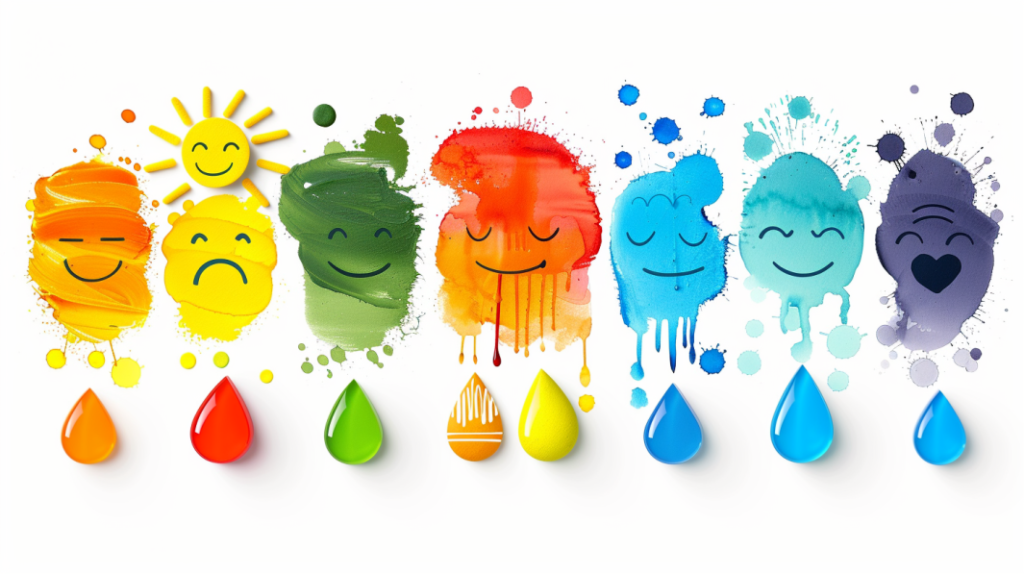
Colors have a profound impact on our emotions and can influence how we feel and how others perceive us.
Emotional Associations
- Red: Passion, energy, and excitement. Wearing red can make you feel bold and confident.
- Blue: Calm, trust, and tranquility. Blue is perfect for creating a serene and professional look.
- Yellow: Happiness, optimism, and warmth. Yellow can lift your mood and make you appear more approachable.
- Green: Balance, growth, and renewal. Green is calming and refreshing, ideal for casual settings.
- Purple: Creativity, luxury, and mystery. Purple can add a touch of elegance and intrigue.
- Black: Power, elegance, and sophistication. Black is timeless and versatile, suitable for almost any occasion.
- White: Purity, simplicity, and cleanliness. White can make you feel fresh and crisp, great for summer outfits.
Tips for Using Color to Influence Mood and Perception
- Professional Settings: Use blue to convey trustworthiness and competence, black for power and authority, and white for a clean, professional look.
- Social Events: Wear red to stand out and appear energetic, yellow to create a friendly and positive impression, and green to promote a sense of balance and well-being.
- Creative Environments: Purple and other jewel tones can stimulate creativity and convey a sense of luxury and sophistication.
Conclusion
Understanding how color theory impacts clothing is an essential skill that can elevate your fashion sense and boost your confidence.
By knowing how to choose colors for different occasions, mix and match warm and cool tones, and harnessing the emotional impact of colors, you too can create outfits that not only look stunning but also makes you feel empowered.
Whether you’re preparing for a professional setting, a casual day out, or a glamorous evening event, the right color choices can transform your appearance and leave a lasting impression.
Embrace the power of color theory to enhance your wardrobe and express your unique style with confidence.